You are here
Who Pollutes Your Community?
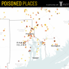
In 2011, NPR and the Center for Public Integrity compiled an interactive map that shows sources of pollution in the United States. What'sthe story for Rhode Island?In the full view of the map, I count about 60 dots in Rhode Island of various levels of risk. The data used for the map is as follows:"The Poisoned Places series relied on analysis of four datasets relating to sources of air pollution regulated by the U.S. Environmental Protection Agency: the Clean Air Act watch list, the Air Facility System (AFS), the Toxics Release Inventory (TRI) and the Risk Screening Environmental Indicators model (RSEI)." You may want to dig into these data a bit to understand them and to consider how your health may be affected. There's a place to enter a place name or zip code. I wonder if the companies listed have made an effort to reduce toxic emissions since these data were collected. That is certainly possible. Apparently, however, these companies have shown up on regulators' radar, and it is important for residents to have access to information about the invisible things that affectour lives.
This map surfaced in an email from Bill Moyers a couple of weeks ago after he had interviewed Gerald Markowitz and David Rosner about toxic disinformation. See a follow-up article, How to Avoid Toxic Chemicals, for further information.